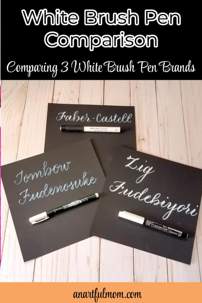
White Brush Pen Comparison
I’ve been wanting to do a white brush pen comparison for a while now. Although I love brush calligraphy and brush lettering in colors, recently I’ve been having fun with white pens on black paper, too.
White brush pen lettering on black paper looks so much like chalkboard writing and is fun for dark journal pages.
So, I decided to do a white brush pen comparison. I compared three popular brands.
White brush pens vary in size and opaqueness, and some are better than others, for different purposes, but there is one pen in this comparison that I can’t recommend. So, here goes.
This post contains affiliate links, which means I’ll earn a commission, if you purchase through them, at no cost to you. Thank you!
White Brush Pens Comparison
The pens I’m comparing today are the Faber-Castell Pitt Artist White brush pen, the Zig Fudebiyori brush pen in Milky White, and the Tombow Fudenosuke white brush pen.

Faber-Castell Pitt Artist Brush Pen in White (101)
I have quite a few of these Faber-Castell brush pens, in many different colors, and they have been some of my favorite brush pens for a long time. (This pen has a very flexible tip, so it’s not the easiest to control, for beginners. But, it’s not the most difficult, either!)
I like this white version of this pen a lot. The brush tip is a really nice size – not too big, not too small – and, the ink is just opaque enough, without being too opaque, if that makes sense. I have seen reviews, though, where people have said it’s not opaque enough for them, so personal preference factors in here. (The photo, above, shows the letters to be a little more opaque and brighter, than in reality. It was hard to get a representative photo!) I like the translucent look of the letters.
Also, I’ve had this one a while longer than the others, so it isn’t quite as opaque as a brand new version of this pen would be. (See the photo of the paper pad, below, where I’ve written “black ultra smooth.” That was written when the pen was pretty new, and you can probably see that it is a bit more opaque and brighter than in the photo above.) So, it did lose some of its opaqueness as it has aged over the last year or two. But, it does still retain a nice level of that, and I like how it looks.

Kuretake ZIG Fudebiyori Brush Pen – Milky White
This ZIG Fudebiyori Brush Pen in Milky White is brand new to me, and I bought it because I love the ZIG Fudebiyori Brush Pens, in general. (I mentioned some of their great qualities in this blog post.)
Interestingly, this white version of the pen has a fatter, more stiff brush tip than my other ZIG Fudebiyoris. The tip on the white one is almost like a soft bullet tip. I don’t like it quite as much as the tip on the ZIG Fudebiyori brush pens that come in colors.

I do like this pen fairly well, though. It is very opaque and looks like chalkboard writing. At first, I was pressing much too hard on the downstrokes, and it was almost too opaque. As I got used to it, though, I really began to like the look. The size of the letters is a little bit bigger than the Faber-Castell.
Tombow Fudenosuke Brush Pen in White
This one broke my heart because one of my favorite brush pens to use in both black and in colors is the Tombow Fudenosuke.
Unfortunately, I can’t say I favor this white version.
The ink goes on clear, as you write with it. This makes it very difficult to see where you are writing! (In the sample, you can probably see how the lettering goes downhill, as I struggled to write, without being able to see where I was writing.)
It’s also not very opaque. If you write over your original lettering, with another layer, it does become more opaque.
This is my least favorite of the white brush pens I tried (despite the fact that I prefer the brush tip of this pen over the other two and despite the fact that the Tombow Fudenosuke colors are my current favorite small brush pens.) The inability to see where you are writing is a deal-breaker for me. If that doesn’t bother you, though, you might like this one, as the tip is great and easy to control.
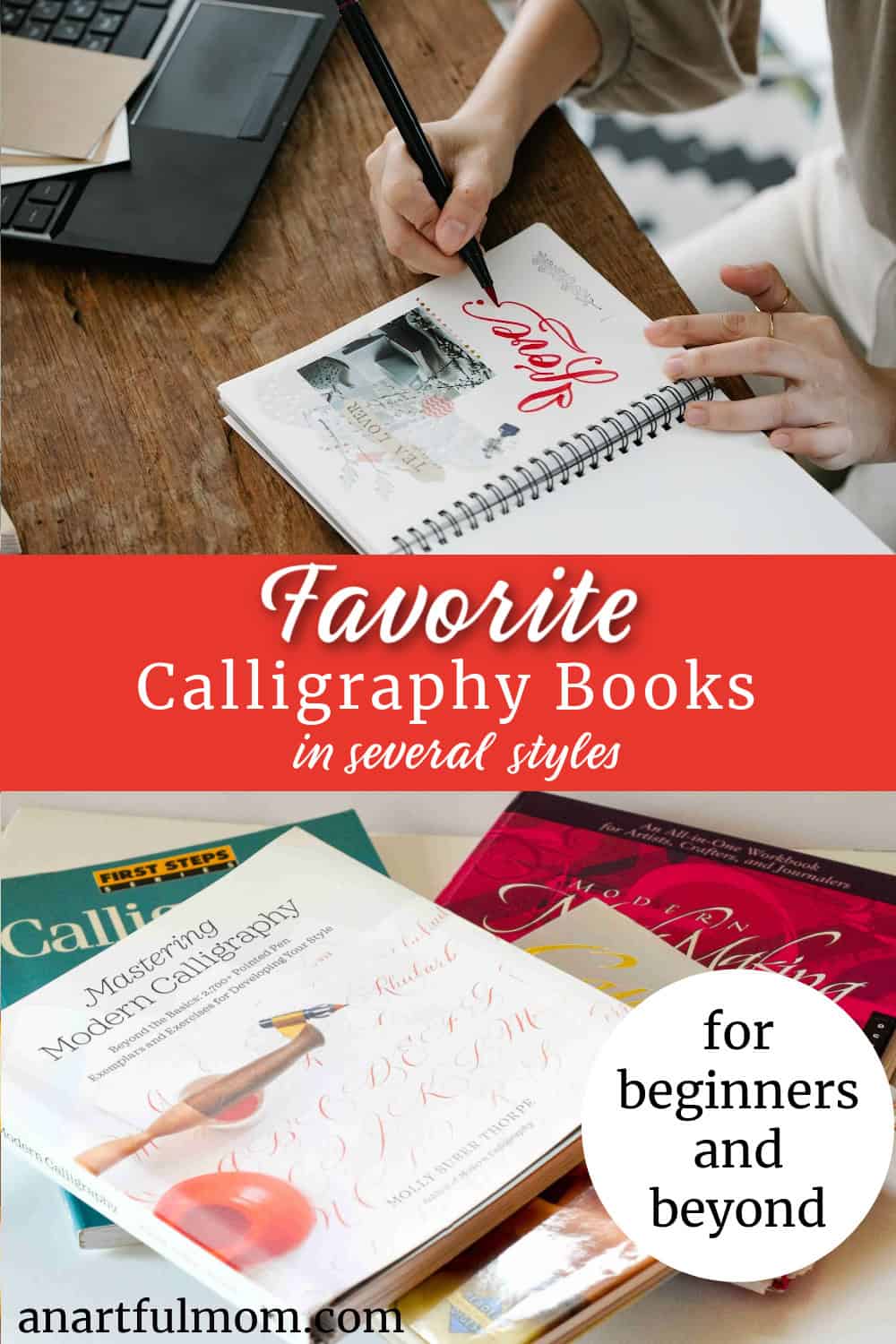
Summing Up
So, which is the best white brush pen? Your opinion might be different, of course!
In short, I like the Faber-Castell white brush pen the best, and the Tombow Fudenosuke white brush pen the least.
The fact that the Tombow writes clear, before turning white, is a deal-breaker for me. Plus, it’s less opaque than the others, unless you add more layers.
The Zig Fudebiyori white is a tiny bit disappointing because I expected the tip to be the same as my other Zig Fudebiyoris, and it isn’t. But, it is the most opaque and brightest of these three.
None of these are large brush pens, like the Tombow Dual Brush Pen size, for example, so there isn’t as huge of a thick/thin line variation in any of the pens I compared. I think I would like to try a larger brush pen to see what kind of effect I could get from that.
Have you tried any of these? Do you have a favorite white brush pen? Let me know in the comments!


Linking to:
Wonderful Wednesday, Thursday Favorite Things, Shabby Art Boutique, The Answer is Chocolate, Modern on Monticello, Create with Joy , Life and Linda, Creative Jewish Mom, The Cottage Market, Mostly Blogging, Esme Salon Blog, Lou Lou Girls, Sum of Their Stories, French Ethereal, Team Creative Crafts


I love your beautiful calligraphy. Thanks for the info about the pens.
Thank you so much, Julie. I appreciate that!
There is quite a difference in how they look on paper. Having the right pen makes so much difference.
I agree, Donna. It really is amazing how different these three pens are.
A good white pen is like the holy grail I think! Thanks for this comparison, I’ve spent so much money on white pens over the years, hoping to find a perfect one – I’m still looking – but this is really helpful.
You’re welcome, Julie. Thanks for reading – I’m glad it’s helpful!
I wish that I could write in calligraphy. We tried it when I was younger and never could get it right.
I like the black on black pen the best.
If you want to try again, keep practicing, and don’t give up, Christy. It takes a while to “get it,” but practice will get you there!
Thank you because I have been frustrated with some I’ve tried.
You’re welcome – thanks for reading and commenting, Carol. Same here – for some reason, white pens are the most frustrating to me, and each one is so different.
Such beautiful work! Unfortunately not my area of talent, but I sure appreciate it in others!
Thank you so much, Melynda!
Beautiful! I have started to learn calligraphy with a self guided book I got from Target, but I am too busy most days to dedicate myself to it. You have beautiful penmanship and I love these white pens!
Carrie
curlycraftymom.com
Thanks so much, Carrie. The white pens really are fun.
You are so right about the tomboy. Great small firm tip but the ink is just terrible. Unless you’re doing “shading”(tinting I guess) I pulled my hair out thinking I couldn’t use it correctly.
Thanks for your comment, Scott. My disappointment with the Tombow was such a surprise to me because I generally love Tombow products. I completely agree with you – the tip is great, but I don’t love the ink.